Meyer Schapiro: Paul Cézanne’s «The Peppermint Bottle»

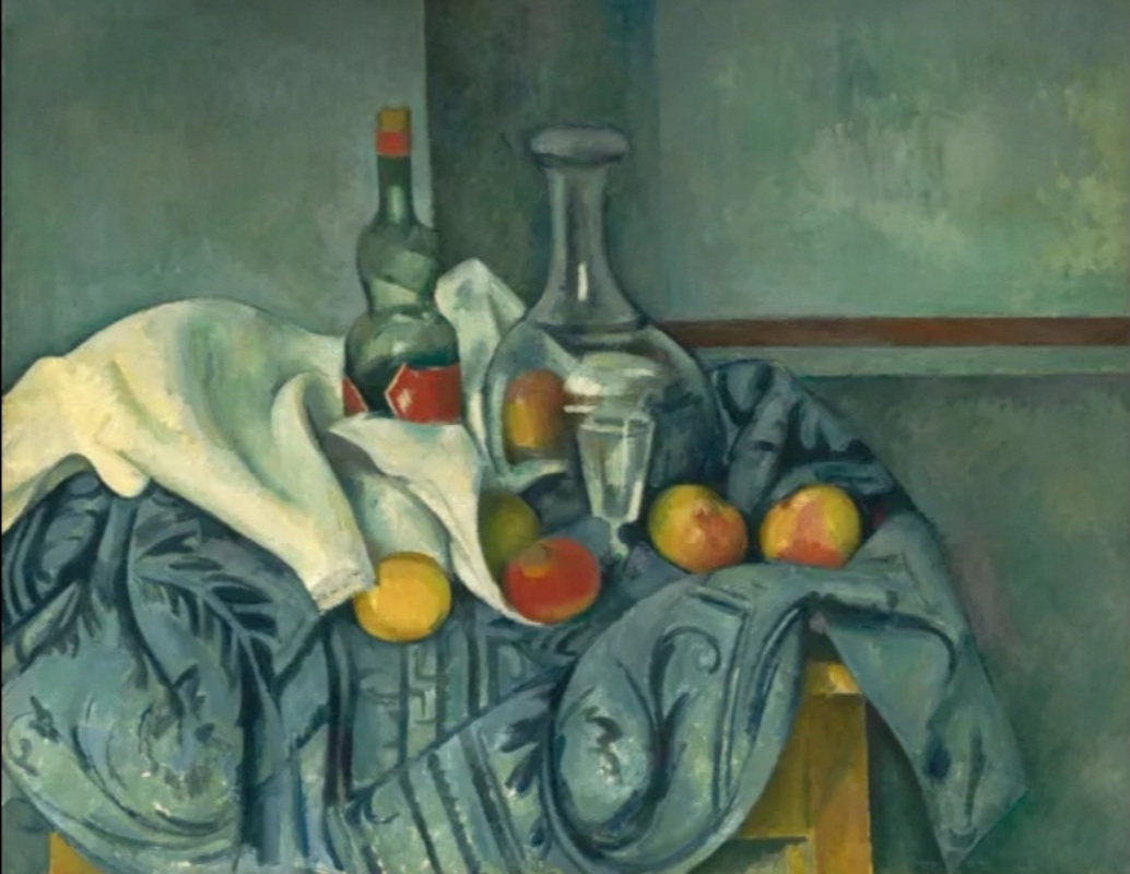
But in this contracted space, Cézanne has ventured to paint, with exquisite skill, transparent glass through which we see several layers of objects; he has also kneaded the drapes into complicated folds in which the objects are set like trees and buildings in hidden depressions of the ground.
In suppressing the horizontal plane, he has given a more evident cohesion to the forms and colors on the surface of the canvas: but he has also played more fondly with the material properties of things, their solidity, weight, opacity, and transparency.
...
The paintings marvelous in the invention of lines. Few of Cézanne’s works are so abundant in curves and continuities. The peppermint bottle with its elegant double curvature, the large flask—simpler and grander—are two melodies of great purity and strength.
Their parts reappear in the simpler roundings of the fruit. Grandest of all are the curves of the cloth—perfectly fresh forms that remind us of no past conventions for drapery lines, but are freer than any we know, although in strict harmony with the neighboring shapes.
...
On the heavy blue cloth is an engaging play of black ornamentation—secondary rhythms of curved and straight forms ingeniously adapted to the lines of the other objects and so deployed that we cannot make out the inherent pattern on the cloth—we know only the more interesting pattern that results from its interception by the accidental creases and folds. It is a free pattern of lines, now rigid like the lines of the wall and table, now curved like the bottles, here florescent, elsewhere branching, and in places with small notes of free-floating form, which remind us of the first abstractions of Kandinsky.
...
Characteristic continuities and crossings of line are the dark reddish band on the wall prolonged in the flask; the vertical line continued in the side of the bottle and re-emerging in the line of the cloth touching the lemon from which descend vertical stripes on the blue drape.
The wall, the figured drape, and the bottle and flask belong to the same austere range of green, grey, violet, and blue with many black accents; the spots of contrasting intensity and warmth—the red and yellow fruit, the table, the cork and label of the bottle—are grouped in vertical and horizontal sets, which maintain the severe architecture of the wall.
...
One must observe also the daring asymmetry in Cézanne's drawing of the flask—the swelling of the more luminous left side reduced and flattened, adjusted to the vertical forms of the adjoining objects, including the apple seen through the glass, and the edge of the white cloth below, which encloses an apple and pear. It is a vivid example of Cézanne's independence of nature in asserting his constructive will.
Chardin would have harmonized all these neighboring object-forms without distortion; but his contours would look less tangibly designed, less overtly marked by the operations of adjustment and cohesion.
National Gallery of Art, Washington, D.C.
